Project
04
↳
Brand identity, Packaging
Bergen—Black&White, Minimal, Swiss
Timeframe: Jan. 2024 - Feb. 2024

Brief
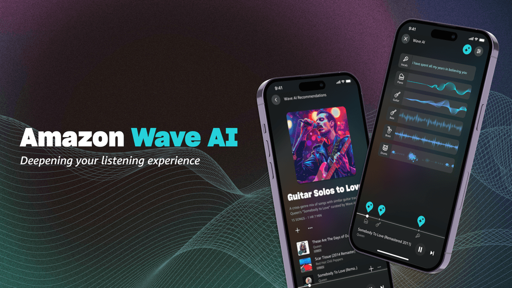
In the Amazon Music Design Challenge, our team presents Wave AI, a user-friendly technology aimed at enriching how people enjoy music. Wave AI allows users to explore the layers of their favorite songs, visualize music, and personalize tracks using AI. By offering these features, we aim to enhance the connection between listeners and music, providing a more immersive and tailored listening experience.
Introduction
01
Our team participated this year's Amazon Music Design Challenge. Our journey starts with this prompt.
Given the current state of Amazon Music, how might AI enhance a customer’s experience with music and/or podcasts?
02-1
Generative Research
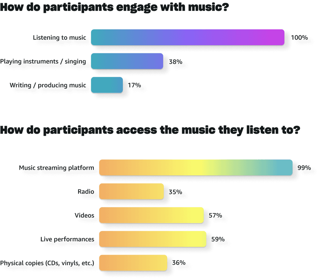
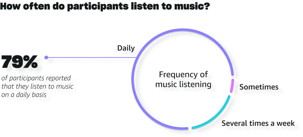
To gain insights into music listeners' habits, interests, and preferences, we conducted a comprehensive survey aimed at understanding how individuals engage with music and access their favorite tunes. The survey was distributed across various platforms, resulting in 76 valid responses.
Our findings reveal that all participants engage with music primarily through listening, with the majority accessing music via music streaming platforms.
This underscores the significant role of streaming services in making music accessible and highlights their status as the predominant avenue for music consumption in today's landscape.
We interviewed six survey participants to delve deeper into their connection with music. Through targeted questions, we explored the goals and experiences behind their music preferences and their unique listening behaviors.
02-1
Generative Research
Insights We Got
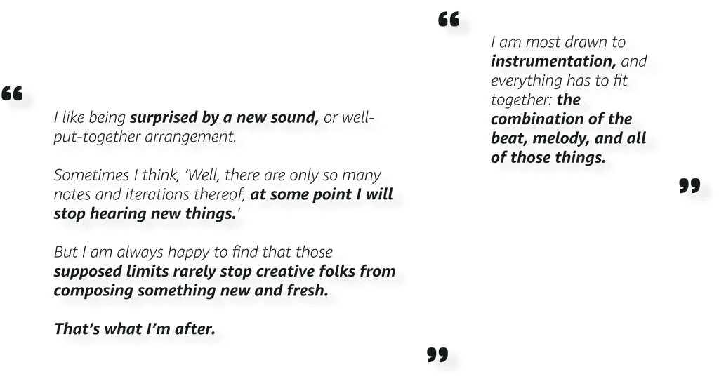
Participants feel drawn to the composition of their favorite music.
Over 90% of the participants from our survey felt that musical composition attracted them to certain music, more than lyrics or artist background.
In the interview, two participants also expressed their attention to sound and instrument.

Active listening can be a challenge for participants, but makes them feel more connected to their music.
Over 90% of the participants from our survey felt that musical composition attracted them to certain music, more than lyrics or artist background.
In the interview, two participants also expressed their attention to sound and instrument.
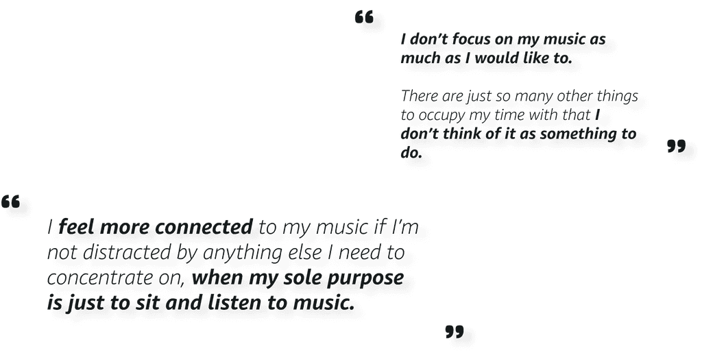
Participants want to engage more deeply with their favorite music and artists.
Over 90% of the participants from our survey felt that musical composition attracted them to certain music, more than lyrics or artist background.
In the interview, two participants also expressed their attention to sound and instrument.


Create
02-2
Different strategies to deal with diversity in UI kit foundations
Text styles, spacing , and grid system: narrow down and streamline
We started with building the UI kit foundations, including text styles, color styles, spacing, and grid system.
In response to the complexity, we streamlined our approach for text styles, spacing, and grid system. For instance, we narrowed text styles down to four groups: heading, subheading, body text, and label.
Color styles: keep the diversity and enhance organization
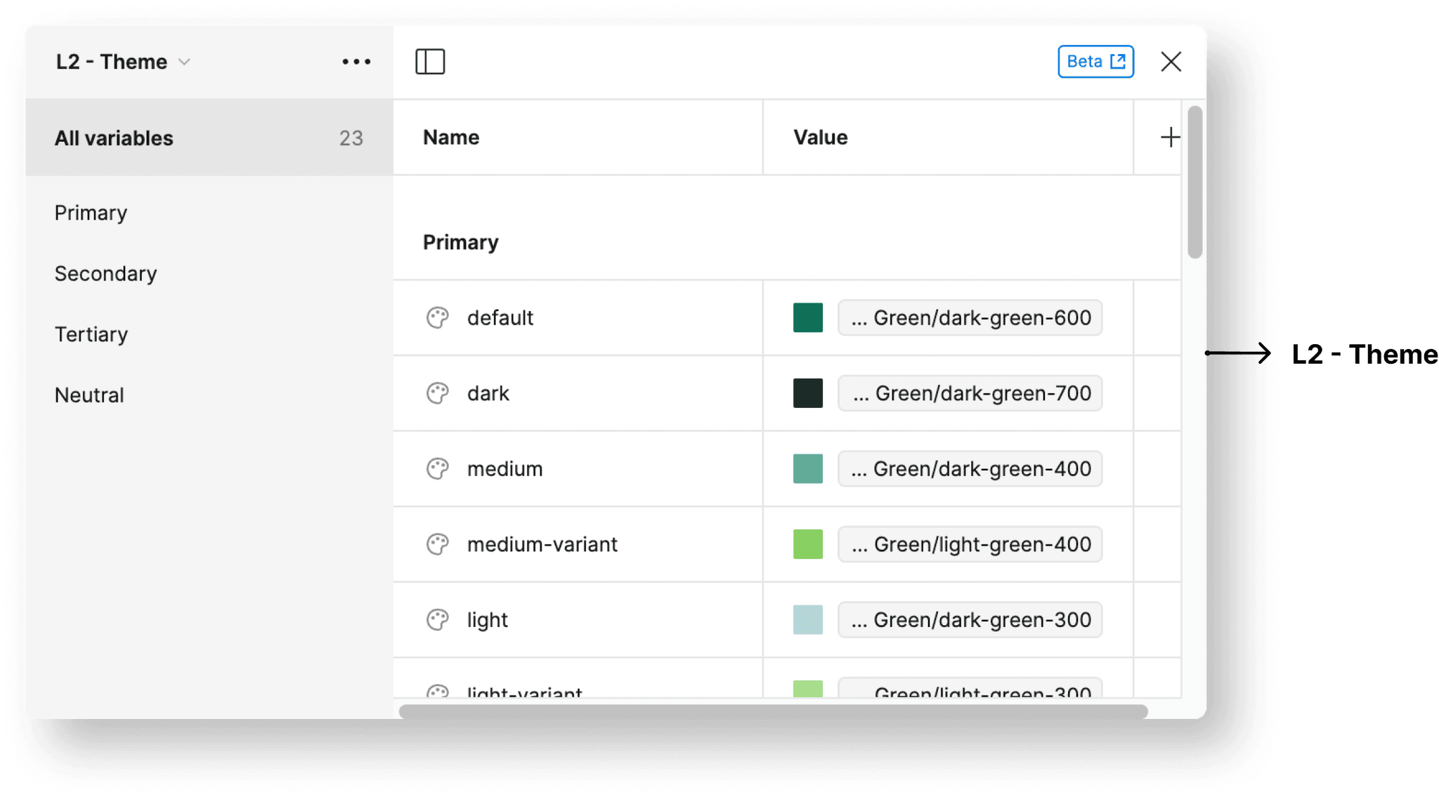
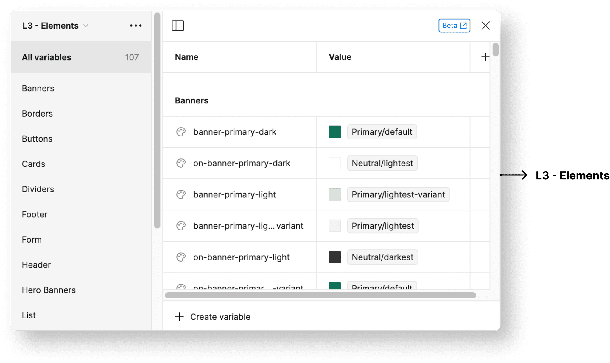
Yet, when addressing color styles, our aim is to preserve diversity, as Jamba’s distinctive and vibrant color scheme sets it apart. Rather than reducing the spectrum, our focus is on enhancing organization. To achieve this, we employ a three-level color token system — Brand, Theme, and Elements level.
Brand color variables encompass primary, secondary, tertiary, and neutral color palettes.
Theme color variables include the specific colors from the Brand level applied on the website.
Elements level variables further define usage specifics, such as ‘banner’ or ‘on-banner’.
Create
02-3
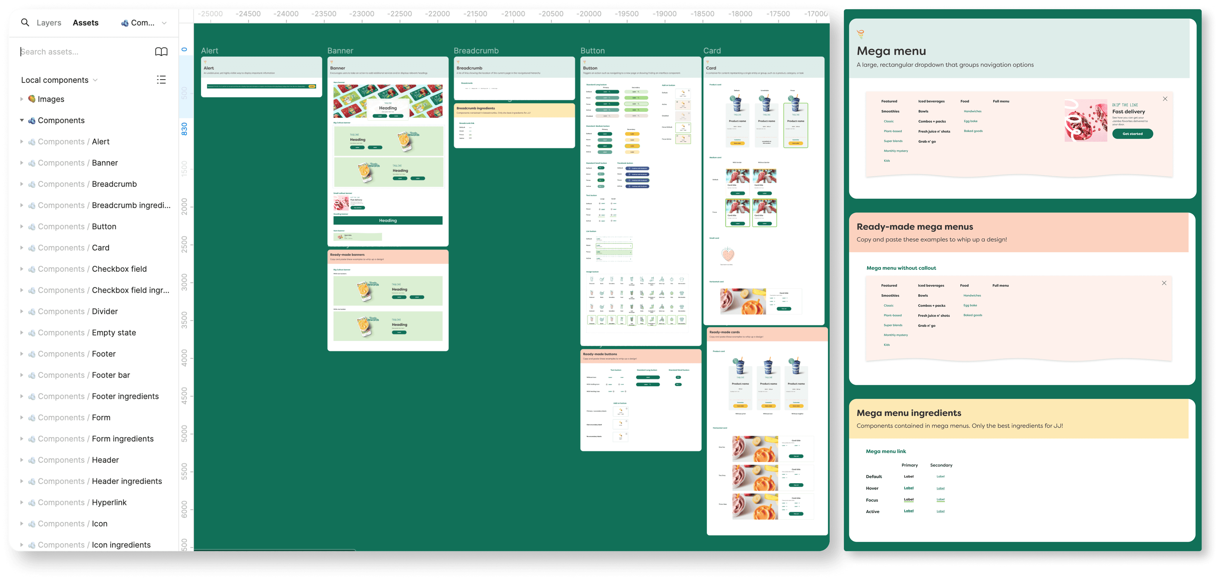
Creating Components in the UI Kit
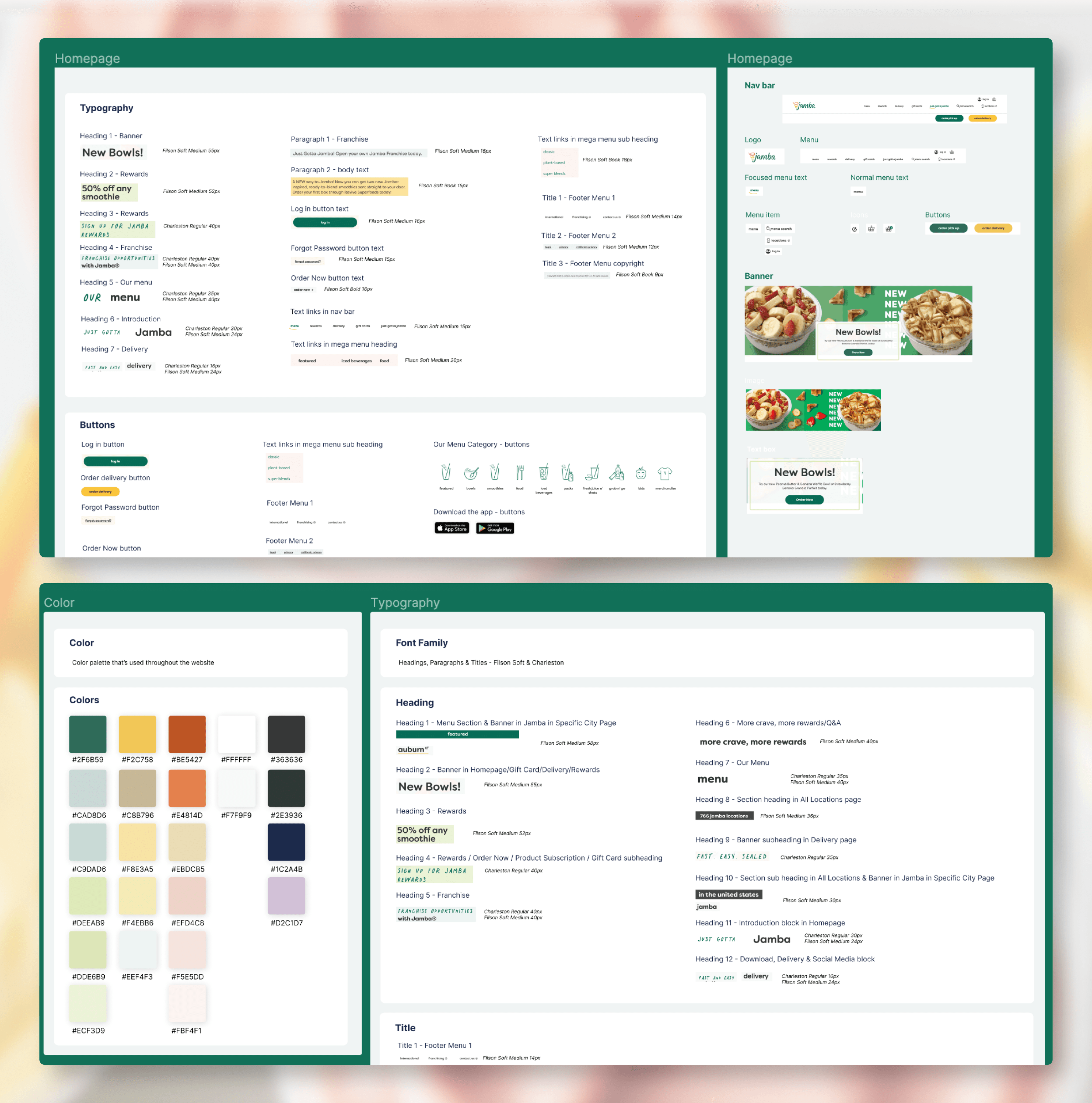
We have 25 component categories, 222 variants intotal. Each component in our design system consists of up to three sections.
The main section provides the main component's name and definition.
When needed, the "Ready Made" section offers all variants for easy copying.
The optional "Ingredients" section breaks down the component's smallest atoms for deeper understanding.
Document
03
Documentation the Design System
With the UI kit ready, our team moved on to documentation. Because we need rules, guidelines, and principles that dictate how and where
various UI elements are used.
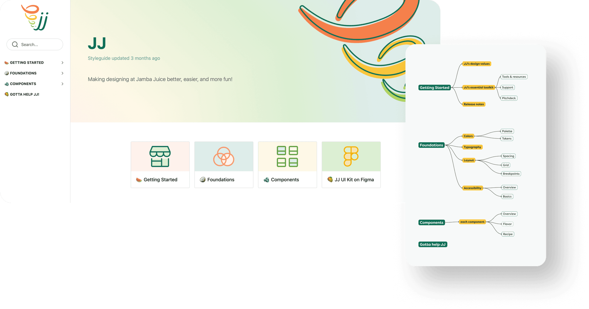
There are four main sections in documentation:
Getting Started
Foundations
Components
Gotta Help JJ!
Keep the tone consistent with branding identity
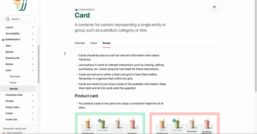
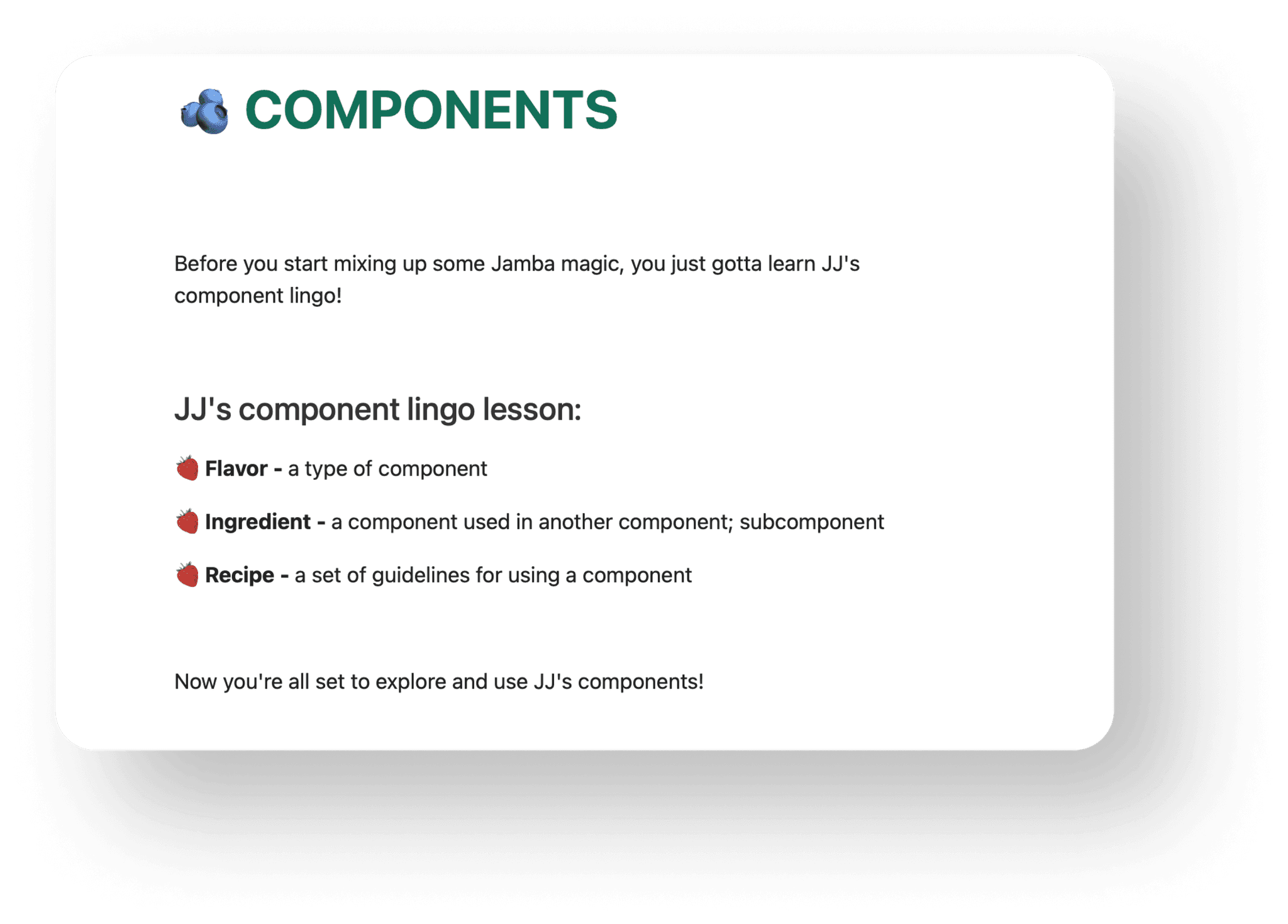
To match Jamba’s branding, we maintained a friendly and playful tone in JJ's design system documentation. We wanted to infuse Jamba's essence into the writing of the design system. To achieve this, we introduced some unique terminology on JJ's component page:
Flavor for component types
Ingredient for components used within others
Recipe for component guidelines
We included the terminology and their meanings on the component landing page for easy reference.
Keep accessibility in mind
Accessibility is a priority in color styles, text styles, and components. JJ is guided by the Web Content Accessibility Guidelines (WCAG) 2.1 A/AA to ensure JJ is accessible in every step of the design process.
Conclusion
04-1
Why should people at Jamba work with JJ?
JJ is an evolving design system ensuring delightful, efficient, and inclusive user interfaces. By working with JJ, the users — designers and developers , are not just fixing inefficiencies — they are unlocking a realm of creativity. JJ provides the canvas; its users bring the masterpiece to life. Picture how fantastic it is to have streamlined workflows, teams seamlessly connected, and customers trusting in a consistent, polished experience.
Conclusion
04-2
Creating JJ: A Collaborative Triumph
In the JJ project, Mary, Keyi, and I collaborated to ensure its success. Two months of dedicated work and continuous communication provided us with a thorough understanding of the project. Despite the long discussions and extensive tasks, the results speak for themselves. Our team not only triumphed over this significant project but also enjoyed every moment of it. As we wrap up, it’s more than celebrating success; it’s about raising a toast to the teamwork that powered our victory, accompanied by a cup of delightful Jamba. Cheers to us! 🥤✨


Project
04
↳
Brand identity, Packaging
Bergen—Black&White, Minimal, Swiss
Timeframe: Jan. 2024 - Feb. 2024

Brief
I helped develop JJ, an unofficial design system for Jamba. JJ includes a comprehensive Figma UI kit with essential elements and guidelines, covering foundations such as grid, color, and typography. We've also provided documentation for a smooth workflow.
Deconstruct
01
An Urge for a Design System
Use Atomic Design to break the website down into pieces
When I deconstructed Jamba's website, I applied the atomic design framework to help me break down the interface into itssmallest UI elements. And then I built the interface inventory organizing UI elements into categories and groups. However, I quickly encountered a significant challenge: the abundance of design elements made organization difficult. For instance, managing over 30 different text styles and approximately 20 colors proved to be a complex task. Additionally, there were certain elements that didn't neatly fit into predefined patterns.
Problem: diversity and inconsistency of Jamba's website
This diversity presented a challenge in maintaining consistency across the website. With numerous variations, not only did designers and developers face increased burden, but users may have found it difficult to grasp a unified visual or brand identity for Jamba.
Motivated by these challenges, our team is dedicated to the development of a design system that provides resources and guidelines specifically tailored for designers and developers at Jamba.
Create
02-1
Defining Design System Principles and Its Name
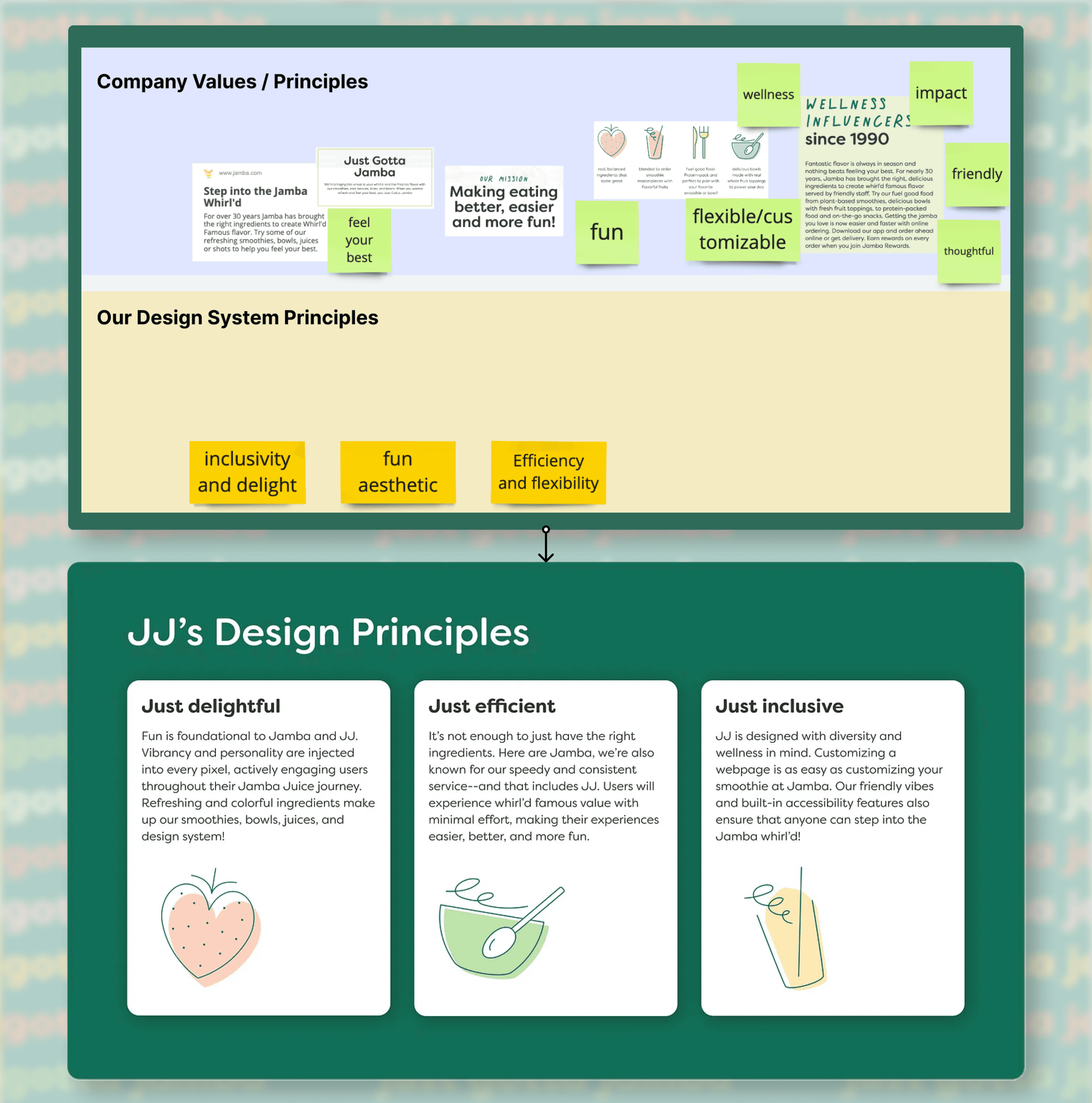
Look at Jamba's mission and brand identity
To start, we establish design principles that reflect Jamba's mission and brand identity. We draw inspiration from their mission to "make eating better, easier, and more fun," and their tagline, "just gotta jamba," which convey a sense of fun, care, and approachability.
Build our design system principles
We observed that Jamba's approach to food is not just about nutrition but also about enjoyment and accessibility for everyone. Therefore, we crafted principles such as "just efficient, just delightful, just inclusive" to align with these values.
These principles can provide actionable guidance for both our team and future users, ensuring the users are on the same page.
Introduce our design system name: JJ
Followed by such principles, we decided to name our design system JJ, representing Jamba’s spirit while giving a personified touch.
Create
02-2
Different strategies to deal with diversity in UI kit foundations
Text styles, spacing , and grid system: narrow down and streamline
We started with building the UI kit foundations, including text styles, color styles, spacing, and grid system.
In response to the complexity, we streamlined our approach for text styles, spacing, and grid system. For instance, we narrowed text styles down to four groups: heading, subheading, body text, and label.


Color styles: keep the diversity and enhance organization
Yet, when addressing color styles, our aim is to preserve diversity, as Jamba’s distinctive and vibrant color scheme sets it apart. Rather than reducing the spectrum, our focus is on enhancing organization. To achieve this, we employ a three-level color token system — Brand, Theme, and Elements level.
Brand color variables encompass primary, secondary, tertiary, and neutral color palettes.
Theme color variables include the specific colors from the Brand level applied on the website.
Elements level variables further define usage specifics, such as ‘banner’ or ‘on-banner’.

Create
02-3
Creating Components in the UI Kit
We have 25 component categories, 222 variants intotal. Each component in our design system consists of up to three sections.
The main section provides the main component's name and definition.
When needed, the "Ready Made" section offers all variants for easy copying.
The optional "Ingredients" section breaks down the component's smallest atoms for deeper understanding.
Click to know more
Document
03
Documentation the Design System
With the UI kit ready, our team moved on to documentation. Because we need rules, guidelines, and principles that dictate how and where
various UI elements are used.
There are four main sections in documentation:
Getting Started
Foundations
Components
Gotta Help JJ!
Keep the tone consistent with branding identity
To match Jamba’s branding, we maintained a friendly and playful tone in JJ's design system documentation. We wanted to infuse Jamba's essence into the writing of the design system. To achieve this, we introduced some unique terminology on JJ's component page:
Flavor for component types
Ingredient for components used within others
Recipe for component guidelines
We included the terminology and their meanings on the component landing page for easy reference.
Keep accessibility in mind
Accessibility is a priority in color styles, text styles, and components. JJ is guided by the Web Content Accessibility Guidelines (WCAG) 2.1 A/AA to ensure JJ is accessible in every step of the design process.
Conclusion
04-1
Why should people at Jamba work with JJ?
JJ is an evolving design system ensuring delightful, efficient, and inclusive user interfaces. By working with JJ, the users — designers and developers , are not just fixing inefficiencies — they are unlocking a realm of creativity. JJ provides the canvas; its users bring the masterpiece to life. Picture how fantastic it is to have streamlined workflows, teams seamlessly connected, and customers trusting in a consistent, polished experience.
Conclusion
04-2
Creating JJ: A Collaborative Triumph
In the JJ project, Mary, Keyi, and I collaborated to ensure its success. Two months of dedicated work and continuous communication provided us with a thorough understanding of the project. Despite the long discussions and extensive tasks, the results speak for themselves. Our team not only triumphed over this significant project but also enjoyed every moment of it. As we wrap up, it’s more than celebrating success; it’s about raising a toast to the teamwork that powered our victory, accompanied by a cup of delightful Jamba. Cheers to us! 🥤✨
© Alexis Li. All Rights Reserved.