Project
04
↳
UX/UI Design, UX Research, Education
Website Redesign: Enhancing Growth and Engagement for New York Microscopical Society
Timeframe: Sep. 2023 - Dec. 2023
Brief
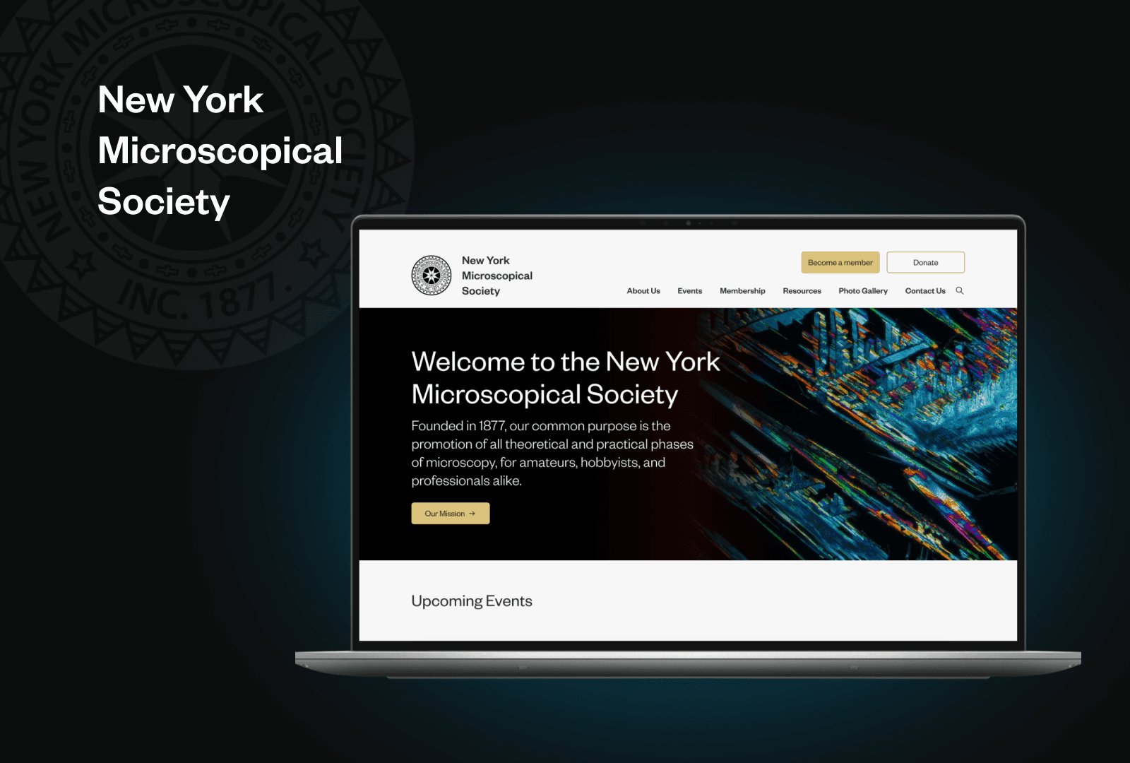
We assisted the New York Microscopical Society in redesigning their website, informed by extensive research. Our redesign encompasses visual enhancements, improved navigation, streamlined flows create a more engaging and user-friendly online experience for visitors.
INTRODUCTION
01
Meet our Client: New York Microscopical Society
The New York Microscopical Society (NYMS), founded in 1877 by leaders of the American Museum of Natural History, has a mission to promote both theoretical and practical aspects of microscopy for all enthusiasts.
Deb Kapell, the current president of NYMS, has reached out to us for assistance in enhancing the society's website.
02-1
GENERATIVE
RESEARCH
Ecosystem Map: Identify Key Involving Groups and Understand Their Relationships
By examining their current site and conducting interviews with Deb, we made an ecosystem map to identify key involving group with NYMS and understand their relationships.
Insights
From the stakeholder map, several key learnings emerge:
NYMS should strategically target and engage a younger audience while maintaining inclusivity for professionals.
NYMS stands out as a volunteer-driven community, where members dedicate their time and energy to the organization. Recognizing members' effort and work is crucial to fostering a sense of appreciation, motivation, and sustained engagement within the community.
The diversity of backgrounds and connections among NYMS members enriches the community.
GENERATIVE
RESEARCH
02-2
Competitor Audit: Understand How the Competitors Meet Similar or Shared Goals
We analyzed the websites of six competitors of NYMS, to gain an understanding of how these competitors were leveraging their digital channels to achieve their strategic objectives.
Homepage
Information Architecture
Visual & Aesthetic Design
Content (Events)
Content (Membership)
Content (Resources)
Insights
We have following takeaways for each dimension:
Homepage
Clean, non-cluttered homepage that states the organization’s mission can help orient users within the site’s architecture.
Information
Architecture
Systematic hierarchy and plain language labels can be leveraged to render IA a tool for navigation rather than an obstacle to wayfinding.
Content - Events
Event flow should be easily found from the homepage and flows should include robust events descriptions and integrated registration flow. Users should be able to readily locate and distinguish between upcoming and past events.
Content - Membershp
Membership flow should be easily found from the homepage. Flow should include pertinent membership information up front (pricing, descriptions of tiers) with integrated payment.
Content - Resources
Resources should be properly contextualized and categories so they can be easily parsed and referenced by users who need them.
Visuals &
Aesthetic Design
Use of sans-serif fonts, a unified color scheme, and images that create visual interest can make the organization feel more welcoming and approachable.
GENERATIVE
RESEARCH
02-3
Interview and User Testing: Understand how Current Members, and New Users Interact with the Website
We conducted interviews and current site user testings with five individuals, each possessing varying levels of familiarity with NYMS and experience with microscopes.
In our interview, we aimed to:
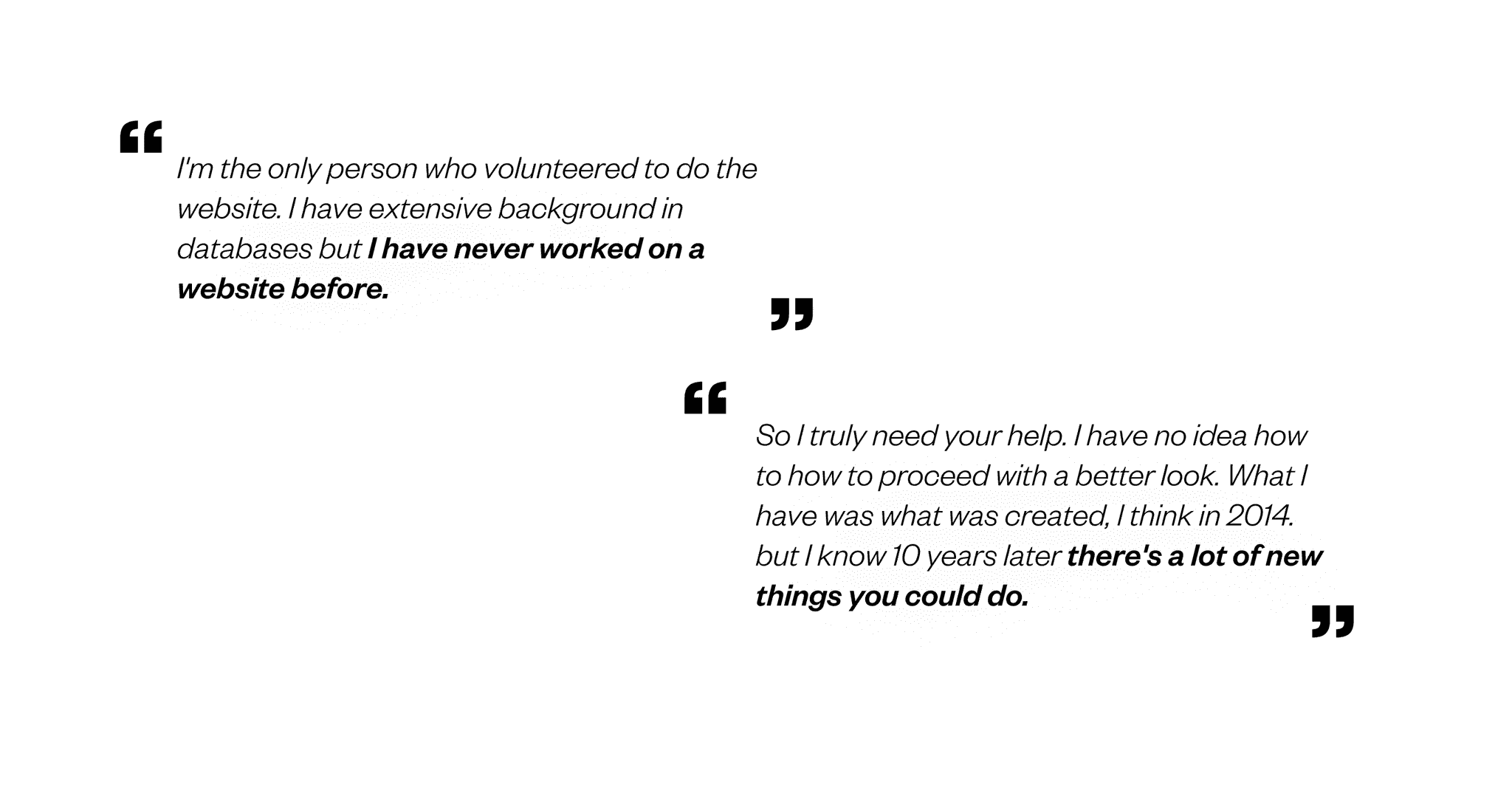
Understand how people think of the website.
Understand how interested people are in the website
In our user testing, we aimed to ask what challenges users have in their:
homepage
event flow
membership flow
Insights
Homepage and website overall impression
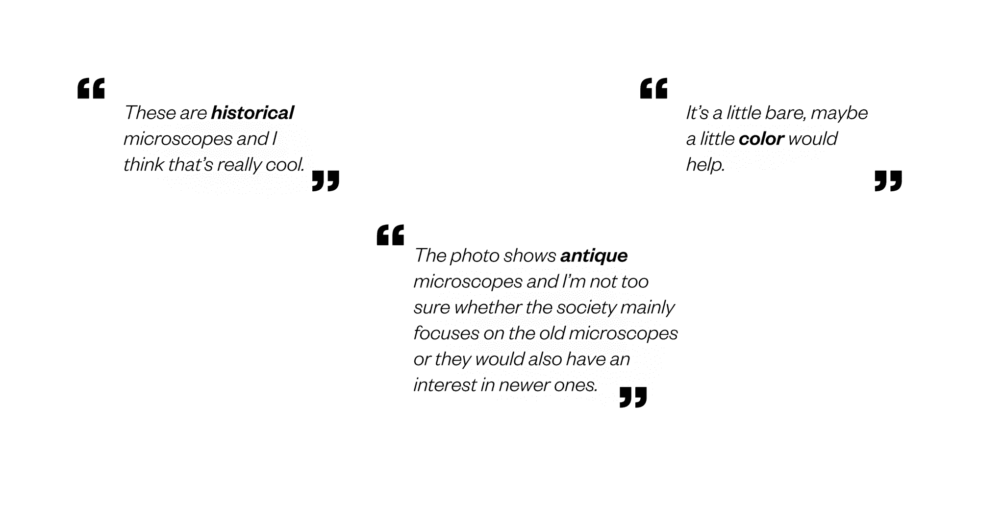
Participants find the content informative and engaging.
They note that the content lacks color and is text-heavy.
The website appears to target a specific group, potentially limiting its appeal to a wider audience.
Event flow
Lack of clear labeling causes confusion for users distinguishing between past and future events in the event flow.
The event page lacks updates on the most current events.
Users are unable to directly register to attend an event.
Membership flow
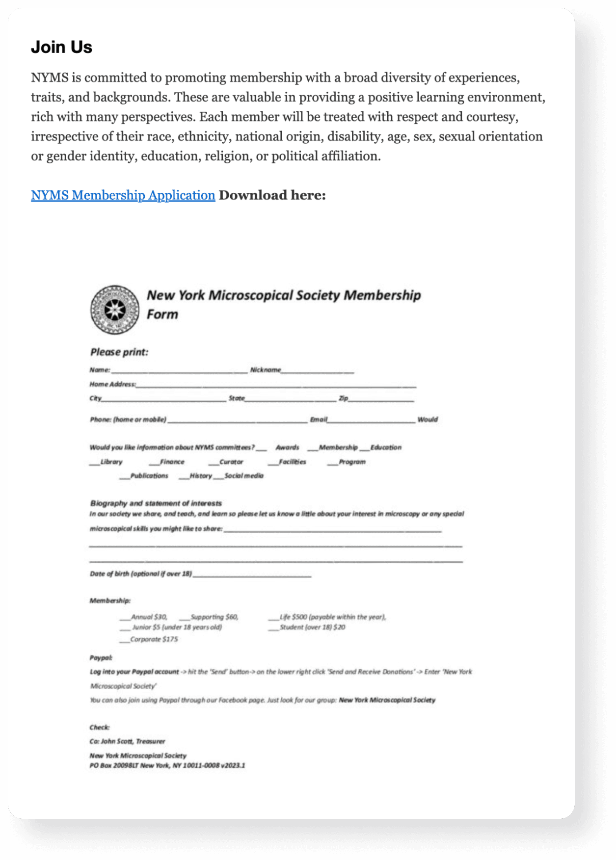
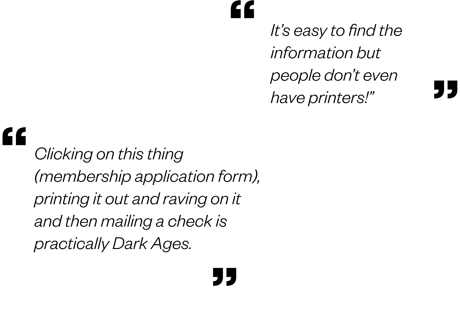
Traditional membership sign-up process involving paper forms and checks via mail acts as a significant hurdle for users.
Membership flow needs updating to maximize rewards with minimal effort for potential members.
Initial step of the sign-up process should be made more accessible and discoverable to enhance user experience and encourage participation.
DEFINE
03
IDEATE
04-1
Craft personas classifying of the potential user types
To further illustrate the practical application of the product architecture, we crafted three personas which represented the potential users we hoped to reach with our redesign of the NYMS website. These personas were generated with a combination of insights from our user interviews and provisional inferences based on our client brief.
IDEATE
04-2
User Flow
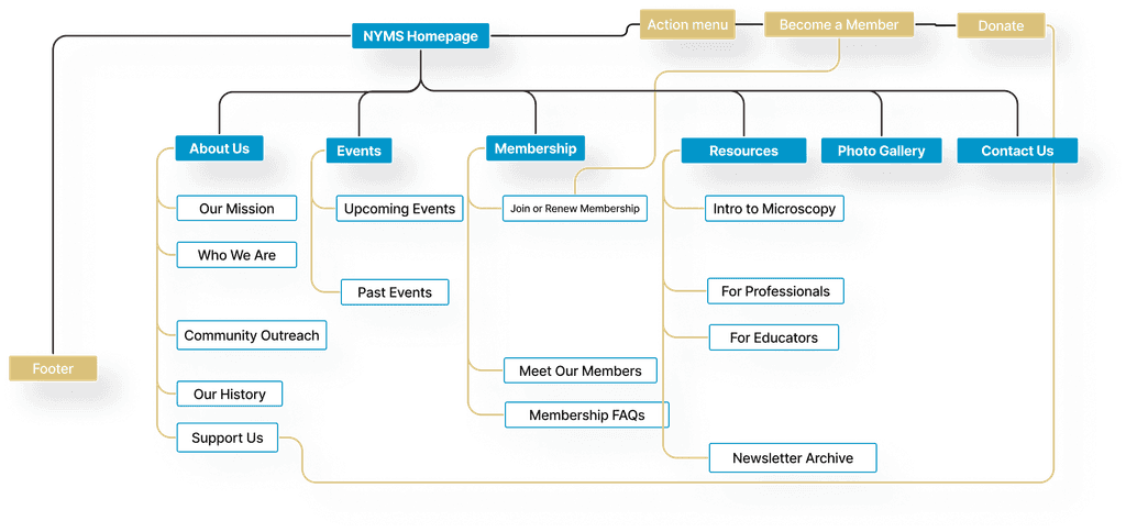
Now having a clear understanding of what our redesign should aim to accomplish and who it would be serving, we developed a revised information architecture to explore how users would navigate the website to meet their needs.
Prototype
05-1
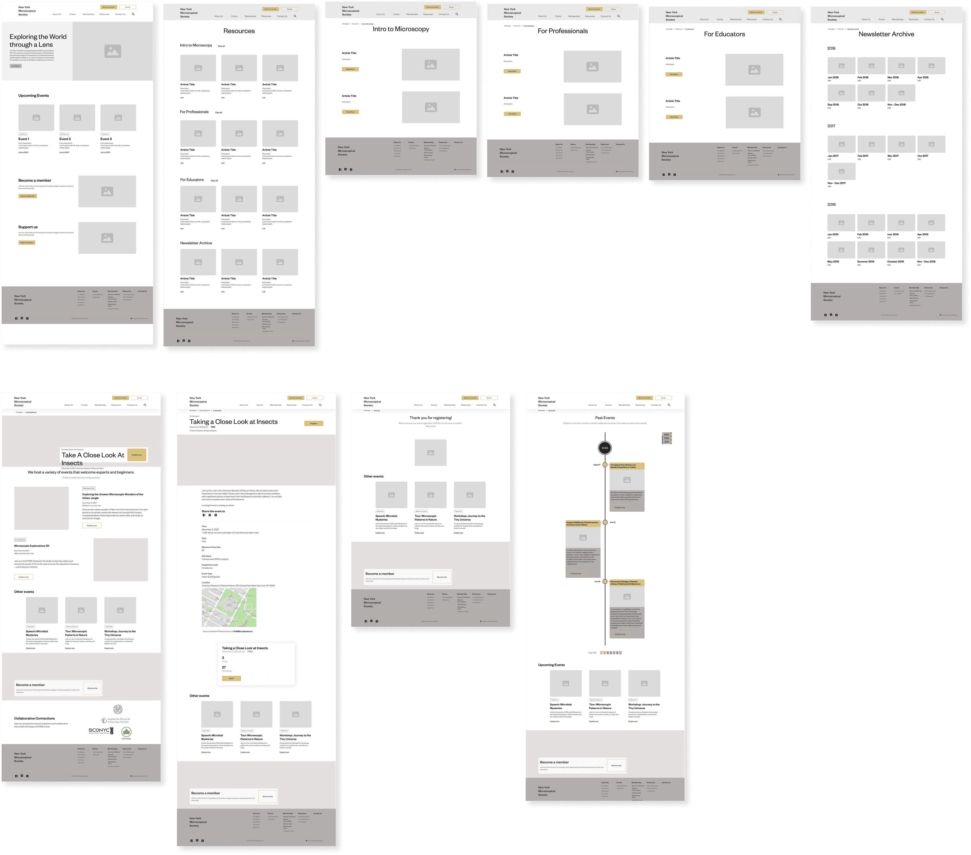
Mid-Fi prototypes
Prototype
05-2
Design Foundations
We opted for the sans serif font 'Founders Grotesk' due to its modern appearance and rounded shape, which complements the graphic of a microscope.
For the color palette, we chose to retain the bronze color associated with ancient microscopes, along with shades of blue, black, and white, to maintain a modern, minimalistic, and scientific aesthetic.
Prototype
05-3
High-Fi Prototype
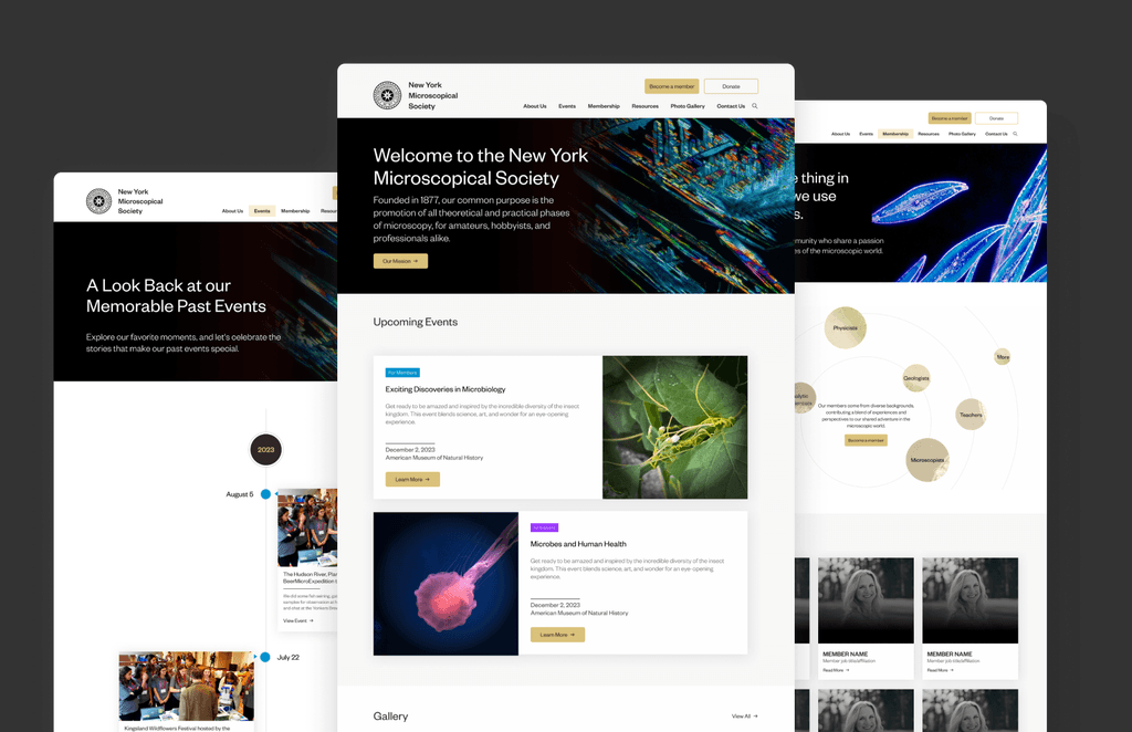
We developed a high-fidelity prototype for the website.
Feedback
06
What do the Users Think?
Excitement for the new website
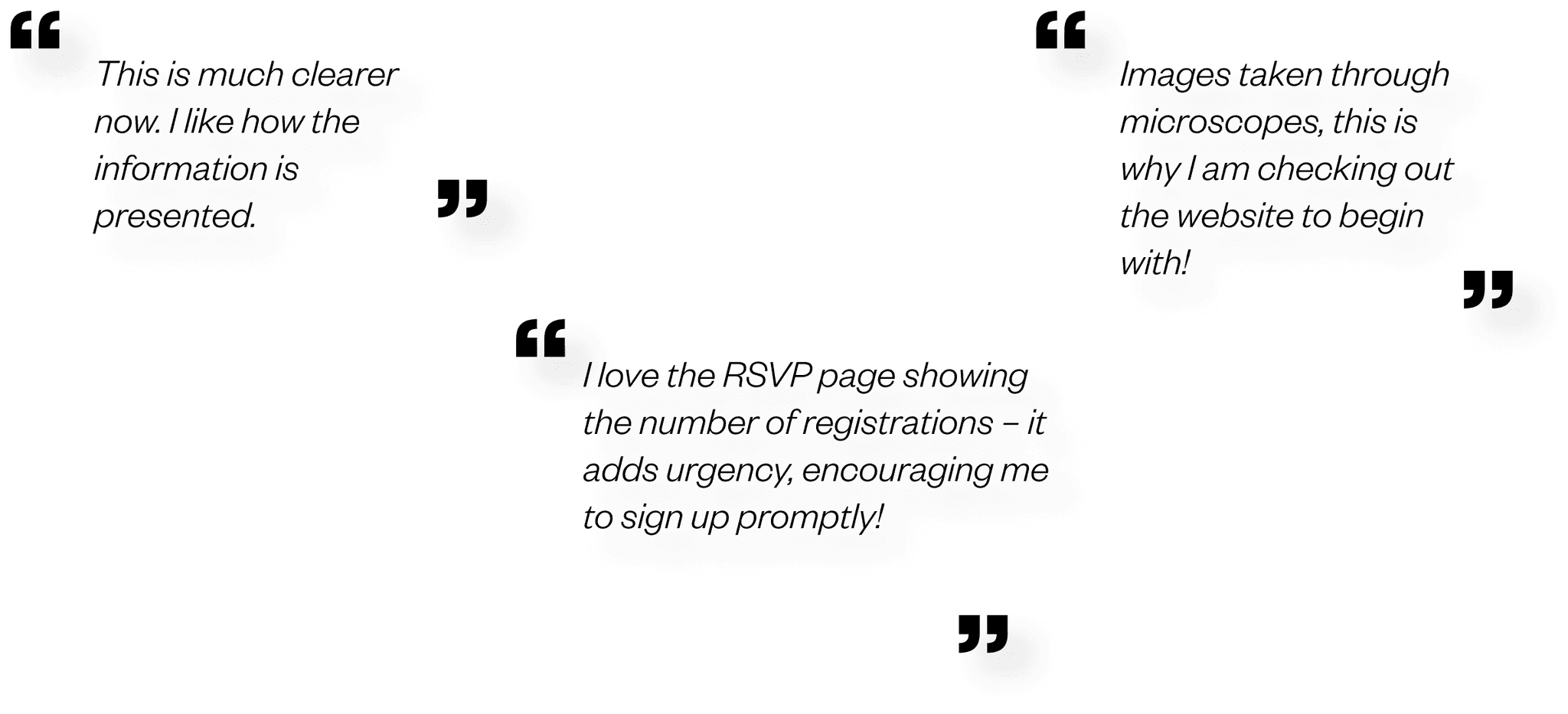
Overall, the participants are very excited about the new NYMS website.
Extended website interaction
All participants are spending more time on the website. The clean layout and lack of overwhelming information make it easy to navigate. The image gallery, especially, caught the attention of both professionals and non-professionals, highlighting the website's effectiveness in appealing to a diverse audience.
Elevated visual appeal
All participants appreciate how the visuals align with the scientific essence and overall vibe of NYMS. The integration of micrographs taken by NYMS on the website has significantly contributed to the improved satisfaction with visuals.
"Love it, love it. It's like magic!"
"I’m dazzled and really excited."
by Deb Kapell
President @NYMS
Conclusion
07
Our journey was all about understanding users, tackling challenges, and creating a website that resonates. From nailing down text style preferences to enhancing navigation, each step brought us closer to a user-friendly and visually appealing NYMS website. We've seen the positive impact through increased satisfaction, engagement, and a website that truly speaks to our audience. The journey continues with design development and refining based on user feedback - exciting times ahead!
